User experience (UX) best practice in your eCommerce store offer consumers faster, frictionless, intuitive navigational shopping experience. It also helps to increase sales, inspire loyalty, improve customer retention and customer lifetime value.
This article will explore how well tuned UX optimisation practices can create a faster and a streamlined shopping experience for potential customers.
What is eCommerce User Experience?
Brick-and-mortar retailers often try to enhance their customers’ shopping experiences by a logical store layout, placement of related items and promoting special offers. All this helps to reduce shopping friction and increase average cart values. Same principle is applied in eCommerce also. However, an ecommerce offers more ways to optimise UX for better consumer engagement during the buyer journey right from landing to eCommerce store to completing checkout.
Increase Page Speed
Initial client engagement depends on the speed of your homepage or a landing page to load. Slower a page loads, higher probability of consumers clicking away.
Page load speed is defined as the time taken for all the elements of given page within your eCommerce store to fully load. An ideal page load speed is 2 seconds. Higher values increase consumer bounce and abandon rate significantly. A reduced server response time, large uncompressed page files, script issues, poor caching can be the few causes for slow page load speed.
A specialist eCommerce UX agency can help you to get better page speed
Intuitive Navigation
Consumers want an eCommerce store with low friction for browsing and shopping experiences. They also want obvious and intuitive information and products. This is exactly what an outstanding eCommerce UX does. It enables consumers to easily find information, to find products, place items in their cart, continue browsing, understand delivery cost, and checkout easily, as though it’s second nature.
Clear Signposting
An eCommerce website navigation is actually a journey to find information, to shop and then taking a final step towards conversion. A path to follow and guiding signposts can make this journey easier. CTA (Call-to-action) buttons, like add to basket, add to Wishlist, find out more are such few examples.
CTA button design shape, size, colour, font type etc. its position on a page also impacts its effectiveness. Too early appearance of a CTA catches consumer attention without considering his readiness to act and too low down the page might miss the attention.
A clear and appropriately placed product options can impact UX positively. For example, consumer’s model options, colour options clearly stated delivery and returns information with product image creates a better UX.
Focusing Engagement
Cluttered Pages increase cognitive load and hamper consumers focus call to actions. There should be a proper space for each page element and it should be with readable font styles, sizes, and appropriate colour design, to focus consumer attention.

In an Experiment by Iyengar and Lepper it was found offering more items for people to buy attracted more interest but resulted in far fewer purchases compared with fewer items on offer.
Offering more item for choice drive consumers away
Product Search
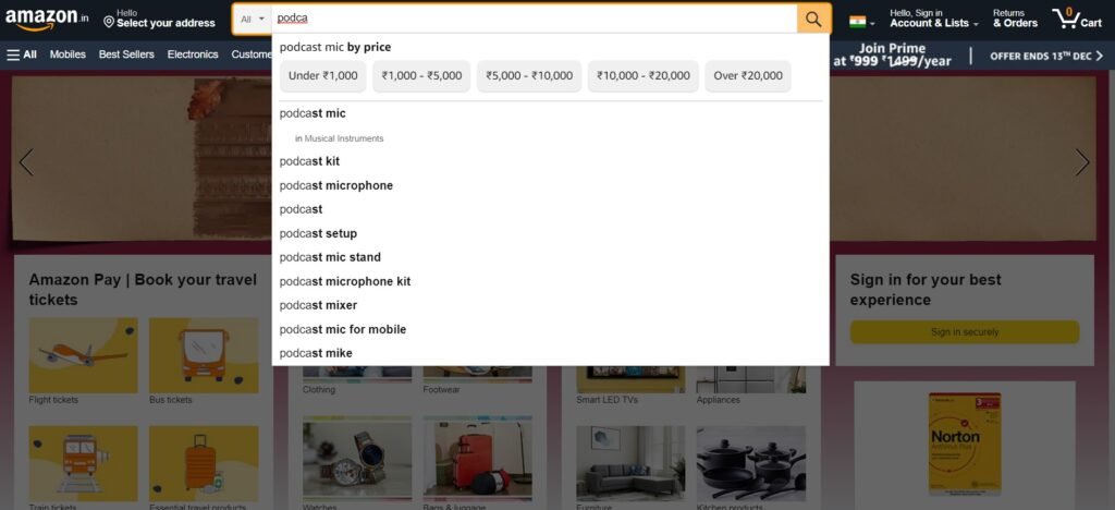
A positive UX enable consumers to perform product searches quickly and easily on keywords with relevant results. Semantic searches should be used for more productive and valuable searches.
Semantic search is a search query aims to determine the intent and contextual meaning of search terms besides the keywords. Semantic site search is more relevant than plain text searches. A wrong product on site search damages UX , especially when it return no results at all.

Reduce Checkout Form Friction
Our experience says that checkout process in eCommerce store is the process where a consumers will experience highest level of friction. A quick and streamlined checkout process reduce cart abandonment and ensure outstanding UX and conversion.
Stumbling blocks like long forms should be replaced with obvious information like name, contact information and payment information. Any other information for marketing and customer relationship building can be gathered after purchase or better in welcome email. Similarly, a guest checkout on ecommerce store bypass account creation and long forms for product purchase.
Gathering customer information at Checkout diminish UX and reduce conversions.
Avoid Price Shock!
A Price Shock specially in Price sensitive markets is a sure shot way to ruin an otherwise good UX. A price shock for a potential customer is a higher order total than expected after spending time on shopping on eCommerce store and is ready to buy. More often than not, the price shocks are due hidden or unclear delivery costs. The simple solution to avoid Price Shocks is explicitly reveal the delivery cost on product pages.
Offering free delivery, or a free delivery threshold, which will help to raise the quality of UX and increase average order value.
Appropriate Payment Methods
Payment Methods offered on ecommerce impact the Checkout UX. An appropriate payment method based on type of products sold and type of potential consumer for those products matching audience’s expectations will help improve checkout UX.
eCommerce store now must offer e-wallets, such as Google Pay and Apple Pay besides credit and debit card payment options. Cash on Delivery (COD), direct money transfer, prepaid/gift cards, deferred payment methods like interest free EMIs can help to improve UX. Larger ticket items can offer deferred payments whereas e-wallets, and debit cards suits for frequently purchased lower price items.
Offer Seamless UX
Comparison websites and consumer’s quest for informed buying decision has made Shopping journeys ever more complex. A buyer now visits multiple websites and consult and research social media, see videos and reviews and expect product demo for a better buying decision.
eCommerce store must offer Interaction choices. An omnichannel approach and a consistent UX across all the touchpoint across all the channels whatever it be mobile or desktop, or across channels ensure positive Customer Experience (CX). For example, a consumer should be able to enquire about a product through any channel email, contact form, social media etc and conversation should flow via a single source of truth.
Conduct UX Testing
A continuous testing combined with an overall ecommerce store optimisation strategy, can improve UX and subsequent conversion rates.
A regular testing for eCommerce store can be done using tools like A/B testing, heatmaps (pictures) and google analytics metrics like click rates, average time on page, and page bounce rates.
A specialist eCommerce UX agency can optimise your store for better UX and improve UX further at every stage and touch point of the shopping journey.
Final Thought
Check your store performance and improve UX for your online store. Get in touch with an experienced eCommerce consultancy today for a chat with a UX expert.


